Saturday, November 29, 2014

Figure paintings and pastels

Some items from figure painting and figure drawing.  I think overall I'm on a good track but there are drawing issues that still exist, which can still be a difficult task to do even for three day poses.  Excited to continue Figure painting next semester though.  I would like to get up closer to the model to really tighten up the structure and features more but gets hard with a full class so hopefully next semester class will not be as crowded.


oil on gessoed illustration board, three day sitting.
Pastel three day sitting
Pastel one sitting
30 min Pastel study one sitting

Both watercolor one sitting

quick pastel studies

Many of the paintings weren't as successful and took well to pastels when are teacher thought it would be good so we can attack color.  I think it helped especially the painting at the top.  I took to pastel quite well and maybe will try an illustration next semester.

Friday, November 28, 2014

Through Nocturne Forest

A personal Illustration.  Watercolor and Colored pencil.
23.5 x 17 inches

Of Mice and Men Book Jacket


A book cover illustration for "Of Mice and Men"  I chose not to include the text but focus on the illustration itself.   This particular cover is designed as a wraparound cover or book jacket.  I thought it would be a nice change rather than having the two character walking, as is usually done, and opt for something of the environment that George and Lennie are in, focusing on the drama of the farm through the play of light and shadow, yet still quiet and tranquil.
Watercolor, colored pencil, pastel.

The Gentlemen in the Meadow

An illustration done earlier this semester for class depicting one of Russell Edson's poems.  Watercolor and colored pencil, 27.5 x 17.5 inches.  The poem was "The Gentlemen in the Meadow" and we could interpret it however we wanted.

Some Gentlemen are floating in the meadow
 over the yellow grass.

They seem to hover by those wonderful blue
little flowers that grow there by those rocks.

Perhaps they have floated up from that nearby graveyard?

They drift a little when the wind blows.

Butterflies flutter through them....


Tuesday, October 28, 2014

Illest of Ill 2014

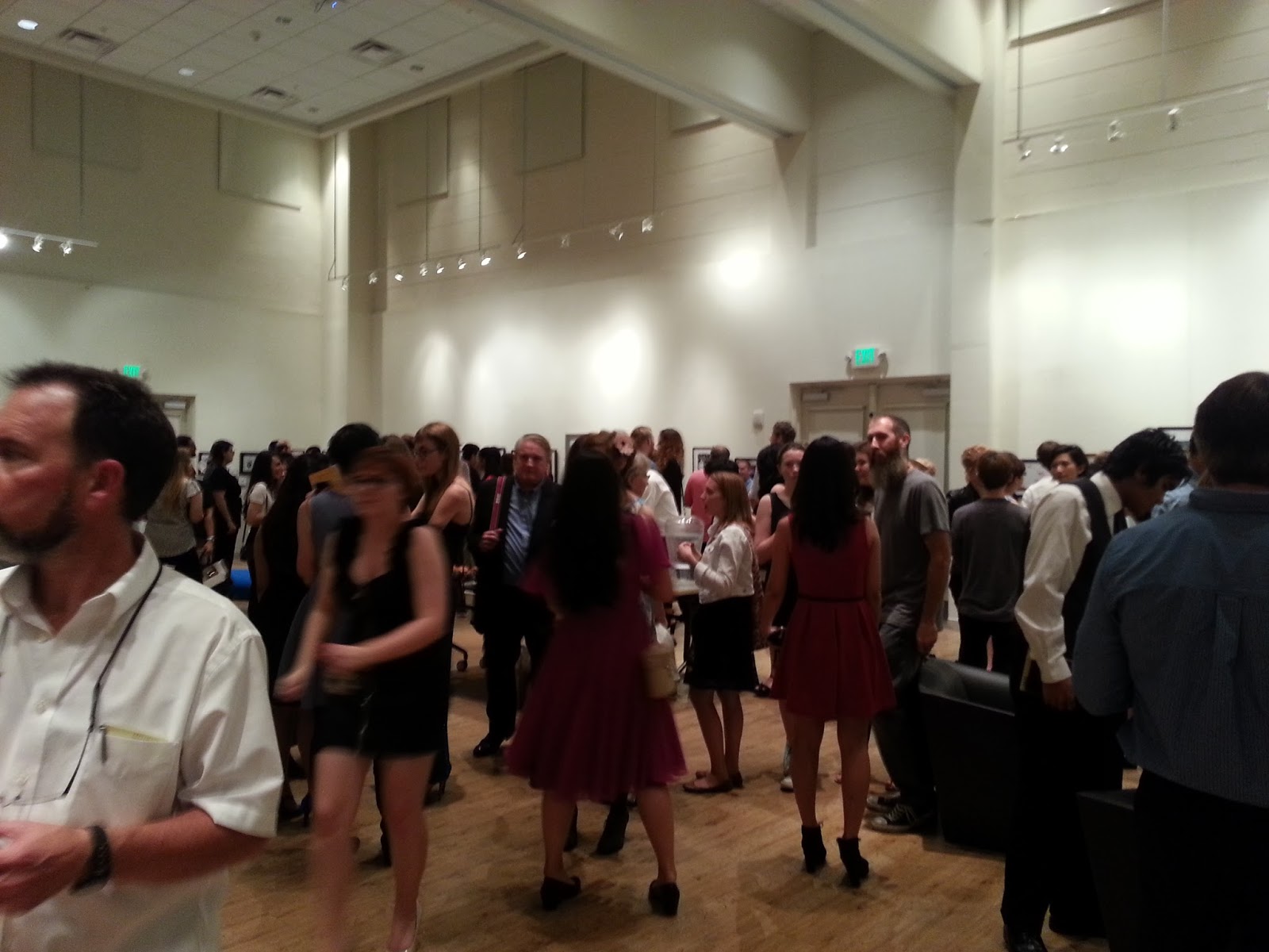
The show turned out great, really great crowd and fun to catch up and talk to people I don't see much anymore do to different majors and workloads and living off campus.  Below are pictures of the event  enjoy :)

Just a few pictures from the show that I really liked.


Pre show set up


This ladies and gentlemen was a $7000 chair. Yep, you heard me, $7000.  Some how someone was able to get a connection with this place that had all this futuristic furniture to go with the show's theme, The Final Frontier, but we got it all for free.  Thank goodness they didn't have to pay cause good lord.......


I will soon be uploading work from this semester, most of it has been traditional so it takes a little longer to document and get back after it's been graded, so stay tuned!

Wednesday, September 24, 2014

Illest of Ill


This year I am happy to announce that I was accepted into the Illest of Ill Exhibition here at Ringling!  It a yearly show dedicated to the work of illustration sophomores, juniors, and seniors at the school.  The show was made by students nine years ago with the help of illustration faculty.  The Illest of Ill team is student run group that participates in fundraising and events to gain money for the show.  They bring in guest judges who are recognized for their accomplishments in the field of illustration and this year the two judges are Victo Ngai and Rebecca Mock.  There is also usually a theme for the event, but the work itself does not have to correspond to the theme.  This year it is the Final Frontier so usually decorations are hung supporting the theme of the event.  Next year I will be one of the students to help out running things for illest, right now I'm an "intern" for the current group learning the ropes so to speak.
The show is October 10th and hopefully I will be able to get some pics to upload for everyone back home to see the incredible work that is done in illustration at the school!
This piece was done in the spring of my sophomore year.  It was two images, one of day and one of night that had to be 12 by 12 inches and done traditionally.  This was done on illustration board with acrylic and colored pencil.

Wednesday, August 13, 2014

Into the Woods

This years fall production at my former high school  is Into the Woods.  However, the director wants to do something completely different and set it in a steampunk world, so instead of trees there would be  big steam pipes and platforms that resemble a factory.  I was asked to do the poster design for the show.  
Inspired by fairy tale illustrators like Arthur Rackham and Edmund Dulac, I thought I would give watercolor a try since I was doing plein air watercolors earlier in the summer.  
I came up with this design of a giant gear in the center with the title moving outside the wheel and steam pipes somewhat subdued in the background, that then from a far could resemble trees in a way.  I thought it would be a nice addition to add the characters into the poster as well since the show is all about how all these different fairy tales come together in a hectic whirlwind of events.

The original watercolor scanned.
 I thought that I got a little too blue and wanted to enrich the colors a bit more to the warmer side which I then did in photoshop.


A early design that would have been more horizontal, but that would have become difficult to hang with other posters from previous shows and other marketing materials that would be needed for the production.  I still like it and was inspired a lot by Eyvind Earle's Sleeping Beauty backgrounds and how I imagine the set would be like.

The poster for the show, minus some other text items that they will add for ticket sales, show times, etc.
I will be uploading future posts regarding what it will be like on the parade float, playbill, t-shirt, etc.